
Challenge
Our team was challenged to create prototypes and design interfaces of the first of their kind dual-screen apps that work simultaneously on the primary and e-ink displays.
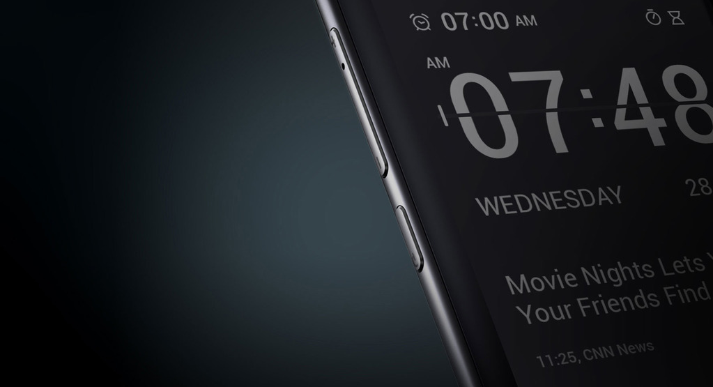
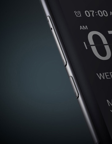
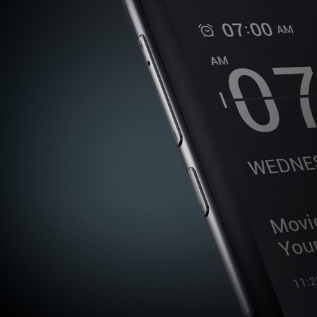
YotaPhone 2
The second generation YotaPhone features fresh new design, more powerful processor and full touch e-ink display on the back side of the phone. The back screen is always on, allowing the user to receive notifications and other important information even when the primary screen is in standby mode.


Yota Devices is a privately owned international company that specializes in the development and production of high-tech consumer LTE electronics such as smartphones, modems and routers. In 2012 Yota Devices released 1 million LTE devices, capturing 6% share of the modem and router segment of the global LTE market. Yota Devices business philosophy is based on the idea of making products that are first of all easy to use.

In the previous version of YotaPhone users could interact with the back screen using a thin touch zone below the e-ink display. YotaPhone 2 allows for more interaction since the whole e-ink display is touch-enabled. This means that the back screen can be used for making and answering phone calls, responding to emails and texts, accepting or declining meeting invitations and posting to social media without having to wake up the color display. This helps save the battery and can provide over 50 hours of runtime.

About apps
Special two-sided YotaPhone apps help perform common everyday tasks like taking notes, reading the news, tracking packages, taking tests, checking the weather and game scores. Each app can have its own small widget or a full screen version for the back display allowing the user to respond to notifications and use most of the features available on the front screen.
So we worked.
A lot.

GUI concept
GUI or Graphic User Interface is a wide set of elements such as buttons, menus, icons, lists, colors, fonts, etc. It sets standards and speeds up interface design process.
We realized that we were going to design multiple screens for a dozen apps, so it was logical to start with the development of general concepts in order to create a unified user experience across all YotaPhone apps. The GUI concept that we developed was based on Android guidelines that existed at that time.
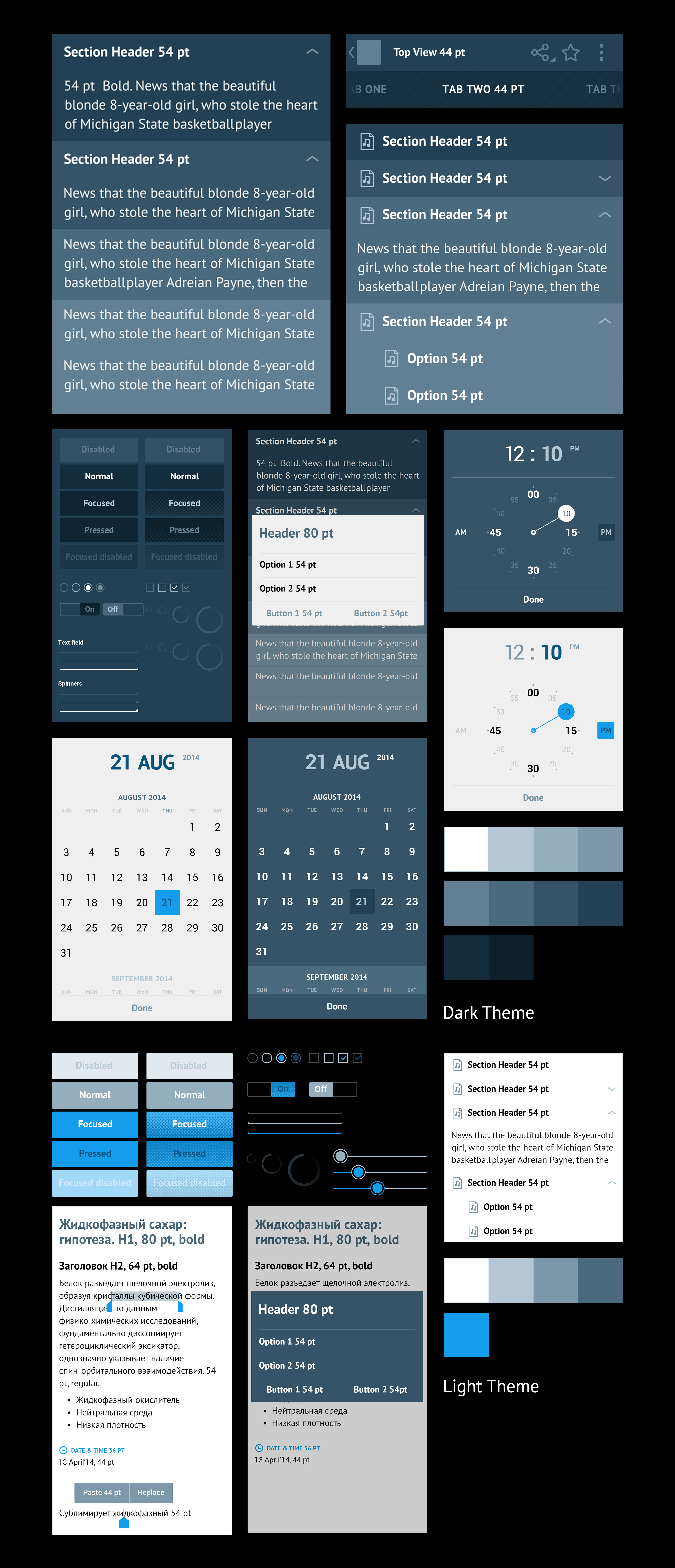


Weather app
The app comes with standard features like daily and hourly forecast along with access to additional information about humidity, wind speed and direction.

Gaming center
The gaming center app includes player ratings, awards and achievements, user profiles and news feed.

Clipper
Clipper is a note taking app that allows to create text notes and lists, add images and voice. The app interfaces for the front screen were developed in accordance with Google Material Design guidelines. It wasn’t easy; at that moment the spec had many blind spots in it and we often had to assume and guess. Despite that working with Google Material Design was a very positive experience from the first day it came out.
In addition to UI for the front screen we created interfaces and widgets for the back screen.


Teach me
Teach me is a learning center. Inside the app you can find tests and math problems, learn languages and other disciplines. You can use the app and its widgets on both frond and back screens.


Shipment tracking
Shipment tracking is a simple utility app that helps you track your parcels and letters delivered by various mail services.


Finance
Finance app helps you keep an eye on currency and stock markets. The app shows current rates, fluctuations for a given period of time and sends you notifications when critical values are reached.


Rss Reader
Standard RSS reader features including news feed, articles, search and adjustment of sources.


Sportcaster
Sportscaster helps you stay up to date on sports news. The app lets you follow game and tournament scores, shows team and individual player statistics and allows to customize displayed content. It’s a very convenient mobile app for sports fans.


Yota Store
Yota app store containing all apps that support dual screen mode.


From Voronezh to Moscow
Our office is located in Voronezh. So when the time came, two brave Manufactura designers went to Yota head office and spent 14 days there tweaking and finalizing the mockups together with Yota Devices design team.

Special thanks to Vladislav Martynov, Georgy Yakovlev, Anastasiya Sidyakina and all Yota Devices team members. It was a long way.

Phone renders provided by Altspace.